
How to design a coherent labeling system in a plant?

Signage in a plant typically grows over the years, character by character, line by line. We show you how to design it as a single system, from information hierarchy to workflow sequencing.
From the hall plan to the finished system
In many plants, signage was developed in stages. Some lines were painted when the hall opened, others were added by the team during line reorganization, and health and safety signs appeared after subsequent audits. Each of these elements made sense at the time they were created. Together, they often create a complex system in which yellow sometimes marks a transport route, sometimes a storage area, and the most important signs get lost among the less important ones.
A coherent system has a single logic. It can be described in a few sentences and applies from the entrance gate to the last workstation. This means that employees moving from one hall to another don't have to relearn the signage, and a new employee understands how the space works more quickly.
The easiest way to build such a system is to start by asking which information is most important.
Information Hierarchy: What Must Be Visible First
Not all information on the floor carries the same weight. When designing signage, it's worth dividing it into four levels.
Level one: evacuation, fire safety, and first aid. This information is crucial for life and safety in an emergency. Evacuation route markings should be visible from any location where someone might be unsure where to go next. It's important to adopt the same goal for firefighting equipment and first aid stations: no one should have to search for them.
Level two: traffic and hazards. Transport routes, pedestrian paths, crossings, mandatory, prohibitory, and warning signs. This level addresses how to move safely around the hall and what to watch out for in a given area.
Level three: spatial organization. Zones, storage areas, aisle numbering, and sector identification. This helps us know what's where and where it should be returned.
Level four: process information. Production boards, workstation instructions, statuses, and indicators. This is the most variable layer, updated even several times per shift.
There's one rule: a lower level should never obscure or overshadow the upper level. A common problem occurs after a redesign, when a new shelf, sign, or banner obscures an evacuation sign. Therefore, whenever the hall layout changes, it's worth checking whether the first level is still visible.
Horizontal and vertical markings: two layers of one system
Occupational health and safety regulations require that transport routes be marked on the floor with continuous stripes in a contrasting color, preferably yellow or white. The floor is therefore the starting point. It indicates boundaries, directions, and the division of space.
However, the floor has its limitations. A forklift operator with a load on the forks can't always see the floor in front of them. The lines disappear behind the racks and pallets. From across the hall, it's difficult to read a floor sticker. This is where vertical markings come in: on walls, columns, racks, and suspended from the ceiling.
Both layers work best when each does what it does best. A line on the floor marks the boundary of the zone, and a sign at the entrance explains what applies beyond that boundary, such as the requirement to wear a helmet. Crosswalk stripes indicate where the road is crossed, and warning signs on either side inform pedestrians and operators who they are about to encounter.
Vertical signage is also useful for orientation. Hanging signs with the sector name or aisle number are legible from a distance and above the merchandise. A plant plan at the entrance allows visitors, visitors, and service company employees to quickly understand the facility's layout.
It's only worth repeating the same information in both layers where the risk is greatest. Duplicating everything everywhere causes important messages to lose their impact.
How to design a system step by step?
- Prepare a base plan. You need two things: a plan view of the hall and photos of key areas. The plan can be a building plan, a machine layout, or an evacuation plan as a starting point. It's a good idea to take photos at entrances, gates, route intersections, and areas near machines. The plan shows the overall picture, and the photos allow you to assess what's actually visible from a given location. Mark existing signage on the plan, including any that has become obsolete due to previous changes.
- Apply movement. Map out cart routes, pedestrian paths, gates, docks, and intersections. The plan doesn't always match how people actually move around the facility, so it's worth discussing with shift workers. The shortcuts they use show where the route layout doesn't meet their needs.
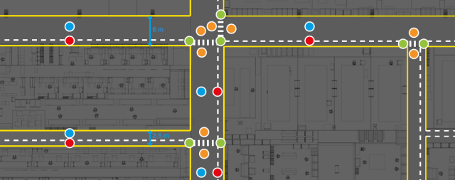
- Start with the first level. Mark exits, evacuation directions, fire equipment, and first aid stations. Check the floor plan and photos to see if the next sign is visible from every point where someone might hesitate. In high-ceilinged halls, wall signs can be obscured by shelving, so consider 3D or suspended signs that are legible from a distance and at an angle. Design this level first, as all subsequent levels must fit around it.
- Establish a color code. Regulations don't mandate colors for storage areas and zones, so you set the code yourself. It's important to do this once, for the entire facility, and record it in the legend. The red field for non-conforming products only works if the red color means the same in every hall.
- Draw the road markings. Transport routes, pedestrian paths, aisles, storage areas, and storage areas. At this stage, the decision on the technology to be used is also made: paint, tape, or stickers. This depends on traffic volume, flooring type, and whether the hall layout is likely to change in the near future.
- Complete with vertical signage. Add it where flooring isn't sufficient: at zone entrances, at route intersections, at specific hazards on machinery, and wherever sector and aisle identification is needed. Then, review the entire design for redundancies. Each sign should have a reason for being placed there.
- Test the design in one area. Before ordering signage for the entire facility, implement it in one area. Walk through the routes through the eyes of someone new to the facility, from the height of the forklift cab. If something is illegible or leads in the wrong direction, corrections at this stage are inexpensive.
Step 8: Write down the standard and designate a responsible person. The color legend, catalog of signs used, and their placement guidelines should be documented and readily available. With each reorganization, someone must remove lines that no longer make sense and add missing markings. An out-of-date line on the floor is more damaging than no line at all, as it teaches that markings are merely suggestions.
What does it look like in practice?
An example of this approach is a project for Heilind Electronics. The company opened a new warehouse with an assembly line, and at the end of it, a showroom frequented by customers and visitors. The warehouse was rented, so permanent floor and wall markings were out of the question. Based on discussions with the client, a single communication system was developed, leading from the office exit to the showroom. This system included fire safety signs, door opening zones, storage areas, foot-shaped stickers to indicate a safe route for visitors, and a plant layout that allowed for quick orientation.
Where to start at home?
Steps one through six are exactly what we do during a visual management audit. We visit your facility, take photo documentation, and interview employees. We then prepare a report, and after selecting solutions, we create a design with a photo visualization of your facility. We produce the signage in-house, and you can install it yourself according to our instructions or entrust it to our team.
The on-site visit, report, and sample box are free of charge. You decide on implementation after reading the report.